

Hey there, I’m your guide to picking the best exterior paint colors for your home. I’ll share 14 easy steps to help you understand your home’s architecture, evaluate your neighborhood, and consider sunlight and landscape. We’ll play with shades, study color psychology, and even test out options. So, don’t stress—it’s all about making the process fun and easy. Let’s give your home the makeover it deserves!
Understanding Your Home’s Architecture
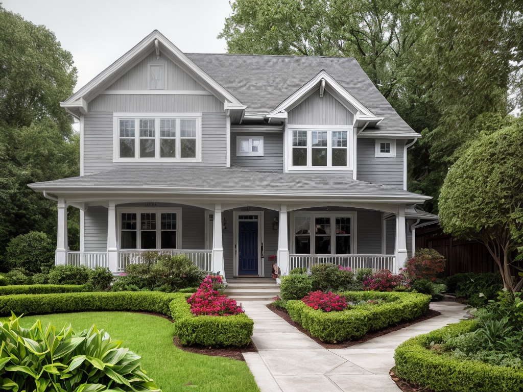
Before I can delve into choosing the ideal paint colors, I must understand the architectural style of my home, as this will heavily influence my decision. I’ve got to survey my home’s design, considering both architectural period influences and regional design elements. It’s not just about aesthetics. It’s about respecting the history and context of the structure. For instance, a Victorian-style home might call for different colors than a modern, minimalist design. Similarly, a house in the Southwest might incorporate colors that reflect the region’s natural landscape, differing from a coastal New England property. It’s all about understanding these elements, and then finding a paint color that harmoniously ties it all together. It’s an intriguing process.
Assessing the Neighborhood Aesthetics
Now, I’m ready to take a good look at the neighborhood aesthetics, which play a vital role in my exterior paint color decision. I’ll walk around, absorbing the overall feel and color scheme. I’m particularly interested in neighborhood color trends as they’re a great source of inspiration. I’ll note down popular shades and patterns, as well as any unique combinations that catch my eye.
However, I won’t ignore the historical color relevance. Many neighborhoods have a distinct character, often tied to their history. It’s essential to respect this when choosing my paint colors. Preserving a historical color palette can enhance the neighborhood’s aesthetic appeal and maintain its charm. So, I’ll do my homework, ensuring my choice doesn’t clash but complements beautifully.
Considering Your Home’s Landscape
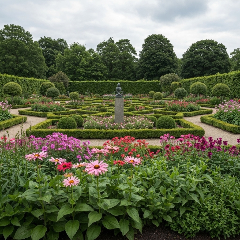
Moving on to the next step, I’m examining my home’s landscape, which plays a pivotal role in choosing the ideal exterior paint colors. Garden influence is significant; the greenery, flowers, and trees in my yard can inspire color choices. Seasonal changes also matter. Remember, the landscape’s look varies from season to season.
Here are things to consider:
- Consider how the garden’s colors, both perennial and seasonal, blend with potential paint colors.
- Reflect on how your home will look during different seasons.
- Determine if you want to contrast or complement the natural environment.
- Think about how the sunlight at different times of day affects colors.
- Consider your home’s architectural style and how it fits within the landscape.
These considerations will guide me in finding the perfect exterior paint colors.
Factoring in Sunlight Exposure
In light of considering the landscape, it’s also crucial I factor in sunlight exposure when selecting the ideal exterior paint colors. Sunlight’s color influence is substantial; it can either enhance or diminish a color’s appearance. For example, colors may seem more vibrant in areas with plenty of sunlight, while they might look dull in shaded areas.
Moreover, the UV resistance importance cannot be ignored. Prolonged exposure to sunlight can cause colors to fade over time. Therefore, opting for UV-resistant paints can maintain the color’s vibrancy and longevity. So, it’s not just about picking a color that I like, but also about how that color will hold up under the sun’s rays. That’s a key step to achieving the perfect exterior paint color.
Studying Color Psychology
Stepping up to the plate of color psychology, I’m diving into how colors can influence our moods and perceptions, which plays a key role in choosing the perfect exterior paint color. The color symbolism impact is essential in shaping our emotional responses to colors. Consider these key points:
- Red often signifies power and passion. It can stimulate and excite.
- Blue suggests serenity and stability. It’s calming and encourages relaxation.
- Green represents growth and renewal. It’s soothing and brings balance.
- Yellow conveys happiness and optimism. However, it can also strain the eyes.
- Black symbolizes sophistication and depth but can also evoke mystery or negativity.
To choose the perfect exterior paint color, I’m understanding not only the aesthetic appeal but also the psychological effects it can have.
Defining Your Personal Style
After gaining insights into color psychology, it’s now time to delve into my style, a crucial factor in the paint color selection process. My style reflects my character and preferences, thus it’s essential to consider color trends exploration and the emotional impact evaluation of my choices.
To help visualize this, I’ve created a table, that includes key aspects of personal style, popular color trends, and their emotional impacts:
| Personal Style | Color Trend | Emotional Impact |
|---|---|---|
| Minimalist | Cool Grays | Calm, Serene |
| Vibrant | Bright Yellows | Energetic, Happy |
| Classic | Deep Blues | Trust, Stability |
| Romantic | Soft Pinks | Love, Calm |
| Bold | Dark Reds | Passion, Energy |
This guide will aid in defining and expressing my style, creating a home exterior that truly represents me.
Using Online Visualization Tools
Having identified my style, I’m now ready to explore numerous online visualization tools that can help me see how various paint colors will look on my home’s exterior. These tools, often referred to as virtual remodeling software, offer a way to preview different colors before making a final decision.
However, be cautious of software limitations. Not all tools accurately portray how light will interact with a color. Here are some tips to keep in mind:
- Always cross-check with physical paint samples
- Use natural light for the best results
- Don’t rely solely on the software; consult a professional if needed
- Remember, the final look may vary due to weather conditions
- Experiment with different shades, the software allows it
With these tools, I’m one step closer to finding the perfect paint color.
Incorporating the Roof Color
Now, one crucial factor I can’t overlook is incorporating my home’s roof color into my exterior paint selection. The roof material influence is significant; it can either complement or clash with my paint choice. For instance, if my roof is slate gray, a cool color palette for the siding and trims would create a harmonious look.
But it’s not just about matching colors; it’s also about mastering color blending techniques. It’s about balancing. If my roof is a strong, dominant color, I might choose a subtle, neutral paint color to soften the overall look of the house. Conversely, a muted roof color could handle a bolder paint color. It’s a delicate art, but I’m confident I’ll find the perfect blend for my home.
Choosing a Predominant Color
The first step in my journey to pick the perfect exterior paint color is deciding on a predominant color that will define the overall character of my home. This color, the most visible, needs to complement the architecture and style of the house.
While choosing this color, we should consider:
- Color symbolism implications: Colors have meanings and can evoke emotions. Choosing a color that resonates with my personality and the vibe I want for my home is essential.
- Historic color preservation: If my home has a historical significance, I need to respect that and choose colors appropriate for its era.
- The surrounding landscape: The color should blend with the environment.
- Neighborhood Color Scheme: My house shouldn’t stick out like a sore thumb.
- Personal preference: Ultimately, it’s my home. I must love the color.
Choosing the right predominant color can be a challenge, but it’s a crucial step in achieving the perfect exterior paint job.
Selecting Complementary Colors
After settling on my predominant color, it’s time to pinpoint complementary colors to enhance the overall aesthetic and balance of my home’s exterior. I’m mindful of color blending techniques to ensure the colors I choose don’t clash, but rather, harmonize with each other. I experiment with different shades, tints, and tones until I find a pair or trio that sings to me.
I’m not just thinking about immediate curb appeal though. I’m considering the impact on property value too. A well-chosen color scheme can indeed up the value of my home, making it more attractive to potential buyers. So, it’s not merely about what I like, it’s also about what the market would appreciate. This is why picking the right complementary colors requires thought and a good sense of color balance.
Experimenting With Color Shades and Tints
Diving deeper into my color selection process, I’ll play around with numerous shades and tints to find the right balance for my home’s exterior. I’ll use the color wheel to help me experiment with different combinations. Blending techniques will allow me to create a harmonious color scheme that enhances the house’s overall aesthetic.
Here are some steps I’ll take during this process:
- Using a color wheel to understand the relationship between different colors
- Experimenting with various shades and tints of a chosen color
- Blending colors to create a harmonious palette
- Considering the impact of light on chosen colors
- Testing color combinations on a small exterior area before making a final decision
This experimentation phase is essential for finding the perfect exterior paint colors.
Observing Color in Different Lighting
Next, I’ll examine how my chosen colors look under various lighting conditions, as it’s a critical aspect often overlooked in the paint selection process. Lighting effects can drastically alter our perception of color. For instance, a soft morning light might enhance a color’s subtleties, while harsh afternoon sunlight may expose color variations that weren’t apparent in less intense light.
I’ll also check the colors under artificial light as it can create different shades. Even the type of bulb can affect how I see the color. Fluorescent light can make certain hues stand out, while incandescent bulbs may warm other colors. Observing color in different lighting ensures I’m not surprised later by a shade that doesn’t look as expected.
Considering Durability and Maintenance
Another crucial factor I’m considering in my paint selection is the durability and maintenance of my chosen colors. It’s important to balance aesthetic appeal with practical considerations. The paint quality and weather resistance of my chosen colors are key factors I can’t overlook.
Here are some things I’m keeping in mind:
- The higher the paint quality, the longer it’ll last. I’m looking for a paint that won’t fade or chip easily.
- Weather resistance is crucial. I need paint that can withstand rain, sun, and snow.
- Maintenance is essential. I’d prefer a paint that’s easy to clean and retouch.
- The color’s durability. Some colors are known to last longer than others.
- Lastly, the cost. I’m considering if the paint’s durability and maintenance justify its price.
Doing a Paint Test Patch
Once I’ve considered durability and maintenance, it’s time for me to conduct a crucial step in the selection process – doing a paint test patch. This involves applying a small amount of paint to a discreet area on the exterior of my home.
The patch size and patch location are key factors to consider. I can’t just slap paint anywhere. It’s important to select a spot that gets a good mix of sunlight and shade during the day.
Here’s a simple guide:
| Patch Size | Patch Location | Why It Matters |
|---|---|---|
| Small | Discreet | Won’t disrupt the overall appearance |
| Medium | Mixed light | Shows how the color looks in a different light |
| Large | Prominent | Gives a better idea of the final look |