


Hey there! I’m your guide to mastering the art of paint color matching. It’s not as daunting as it seems, promise! Whether you’re touching up a tiny chip or painting an entire room, I’ve got the top strategies you need. We’ll delve into understanding undertones, harnessing natural light, testing samples, and using digital tools. Plus, we’ll consider the impact of different surfaces. Let’s demystify this process together, shall we?
Understanding Paint Color Undertones
In my many experiences with paint color matching, I’ve found that the first critical step is understanding the undertones of each color. Undertone identification isn’t always straightforward, but it’s vital in achieving color harmony. You can’t simply look at a color and know its undertone; you’ve got to compare it to other colors. Place it next to a pure white, and you’ll start to see whether it leans more towards blue, red, yellow, or another color. From there, color harmony principles come into play. If I’m aiming for a cohesive, tranquil space, I’ll choose colors with similar undertones. Conversely, if I desire a vibrant, energetic vibe, I’ll opt for contrasting undertones. The key is always being aware of the undertones and how they work together.
Utilizing Natural Light Effectively
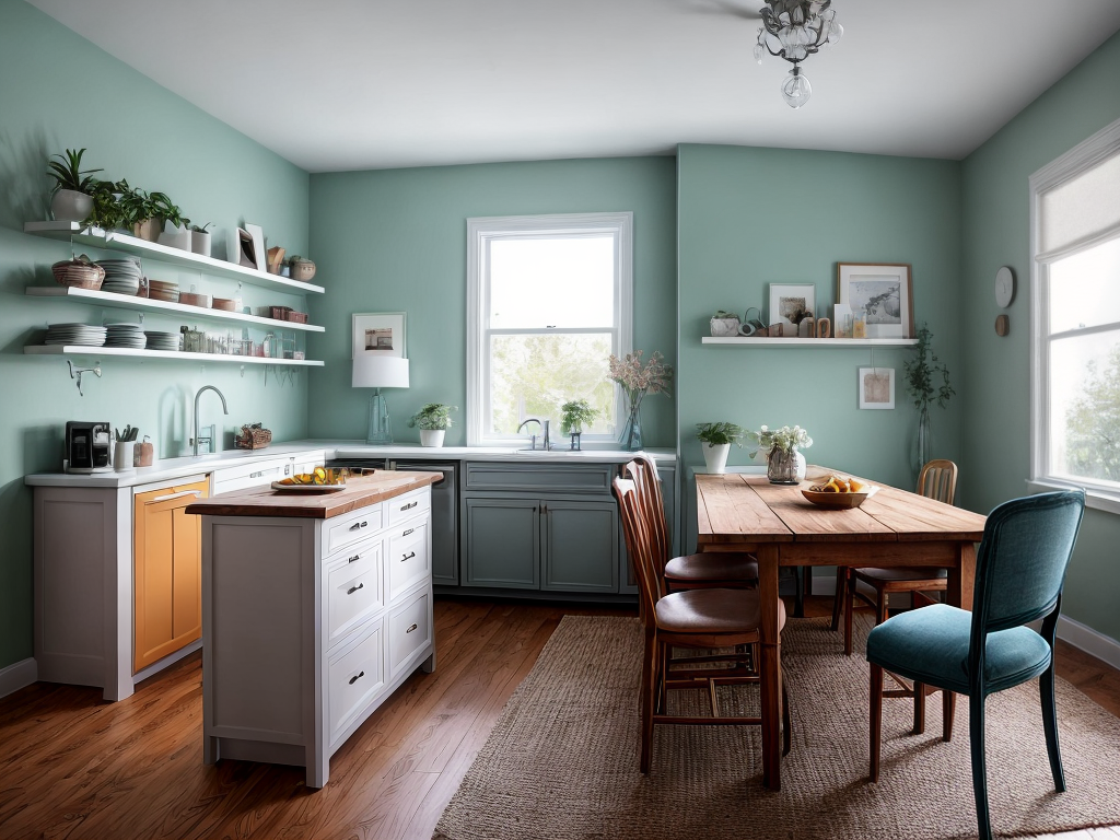
Once I’ve got a handle on the undertones, my next focus is the room’s natural light—a crucial factor in paint color matching. The amount and direction of sunlight pouring in can dramatically alter the appearance of colors. Hence, lighting adjustments and window placements require careful consideration.
South-facing rooms get ample light, so most colors look great. North-facing rooms, on the other hand, have cooler, bluer light, so warmer tones work best. Window placements also play a huge role. I usually observe how light shifts throughout the day. It’s about finding the balance which might mean adding sheer curtains or blinds to diffuse harsh sunlight. By paying attention to natural light, I can ensure the paint color I choose will look its best at all times.
Importance of Paint Sample Testing
After regularly observing the room’s natural light, I always move on to the next critical step in paint color matching – testing paint samples. Sample placement is crucial; I usually apply them on different walls to see how they react to light at various times of day. It’s important to remember that colors can dramatically change under different lighting conditions.
Sample size also has a significant impact. A small swatch might not give a good representation of how the color will look when it’s spread across a large area. That’s why I’d recommend using a larger sample for a more accurate depiction.
Using Digital Color Matching Tools
The next strategy I’m going to discuss is using digital color matching tools. These tools, combined with app integration benefits, can elevate your paint matching game.
Here are some tips and benefits:
| Digital Tool | Benefits | |
|---|---|---|
| 1 | Precision Calibration | Ensures accurate color capture |
| 2 | App Integration | Simplifies data sharing |
| 3 | Online Tutorials | Offers guidance and support |
| 4 | Portability | Enables on-the-go color matching |
| 5 | Saves History | Allows easy access to past matches |
Precision calibration is crucial. It ensures that the tool captures the exact color. App integration benefits include easy data sharing between devices and access to a wider range of matching options. With these tools in hand, achieving the perfect paint color match is easier than ever.
Considerations for Different Surfaces
In my experience, understanding the impact of different surfaces on paint color is crucial for accurate matching. Surface preparation and material compatibility play significant roles in this process.
Consider these factors:
- The material of the surface: Different materials absorb paint in diverse ways, affecting the final color.
- Surface preparation: A well-prepared surface ensures the paint adheres properly, reflecting the true color.
- Surface texture: Rough surfaces can darken a color, while smooth surfaces may lighten it.
- Material compatibility: Some paints may not be compatible with certain surfaces, altering the color outcome.
- Existing color: If you’re painting over an existing color, it can influence the new color.